Although my true passion is interior design, my second love is psychology. I love studying and learning how the human brain works & why we think and feel the way we do. Ever since discovering my love for psychology in high school and majoring in it in college, I’ve been committed to learning about how it plays out in interior design because after all, designing a room is all about how the room makes us feel and how our eyes move through the room using focal points & lines. That being said, I’m so intrigued with how implementing certain colors in a room can affect how we feel when we occupy that space and I’m so excited to share my research on color psychology when it comes to interior design with you! Get ready to uncover how those vibrant hues splashed across your walls can significantly influence your mood and overall vibe.
What Is color psychology in interior design?
Color psychology in interior design is the study of how colors can affect human emotions, behavior, and perceptions within a physical space. It involves understanding how different colors evoke specific psychological responses and designing spaces accordingly to create certain atmospheres or moods.
Interior designers use color psychology to choose the right color schemes for different spaces based on the desired atmosphere and the function of the room. For example, calming colors like blues and greens might be used in bedrooms or living rooms to promote relaxation, while vibrant colors like reds and oranges might be used in dining areas or kitchens to stimulate appetite and social interaction.
Red: Passionate Powerhouse
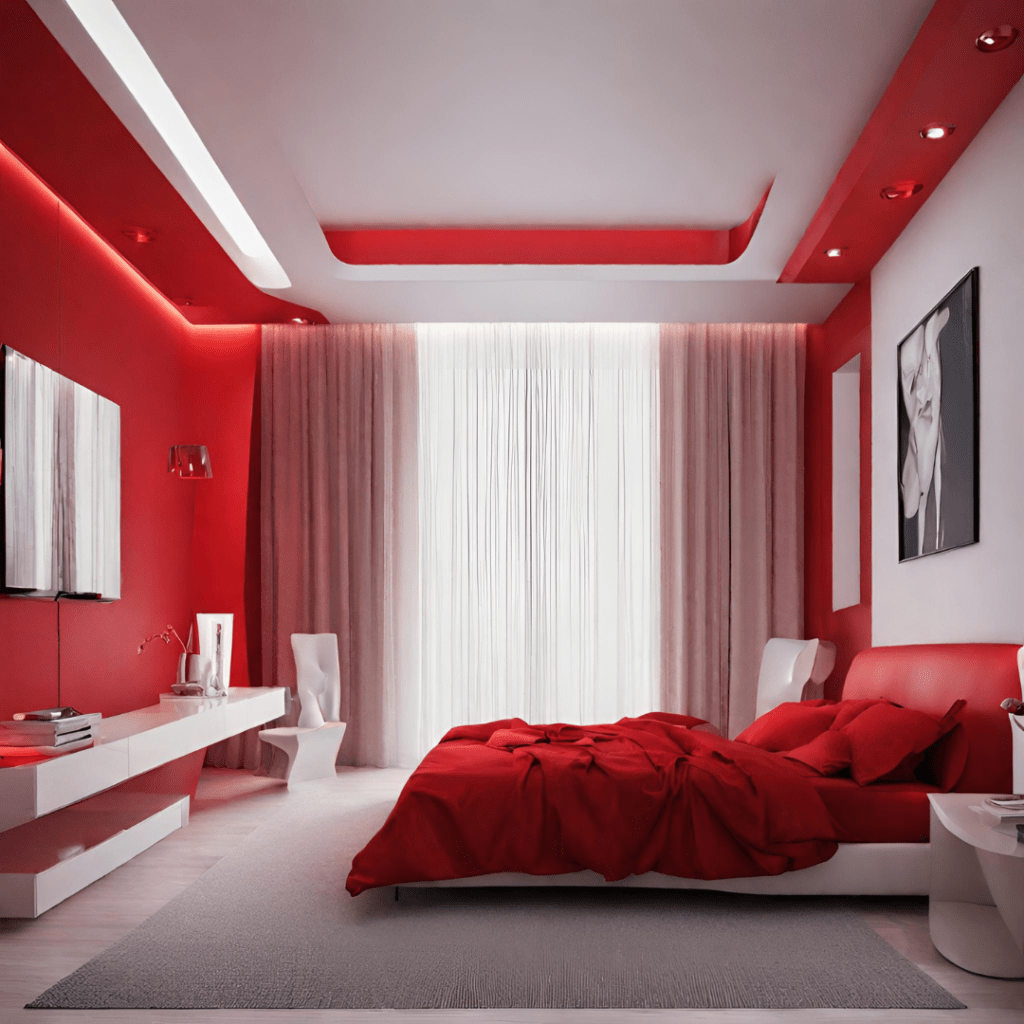
Ah, red – the undeniable attention-grabber in the color spectrum. This fiery hue doesn’t just demand your gaze; it practically screams for it. Have you ever walked into a bright red room and immediately felt some sort of energy ignite in you? Red is all about stirring up emotions, igniting passion, and infusing spaces with a burst of energy. It’s the color of love, lust, and, of course, bold statements. Incorporate red into your interiors for a dose of excitement and a touch of drama.
Red is a powerful color that can evoke strong emotions and stimulate the senses. It is associated with energy, passion, and excitement, making it an excellent choice for spaces where activity and conversation are encouraged, such as dining rooms, kitchens, or social gathering areas. Red can also be used as a striking accent color in interior design to add visual interest and focal points within a room. Whether through furniture, artwork, or decorative accessories, touches of red can create a sense of drama and personality while complementing other colors in the space.
When used strategically, red can help create depth and contrast within a room’s color palette. Pairing red with neutral colors like white, black, or gray can enhance its vibrancy and allow it to stand out as a focal point while maintaining a balanced overall look. Since red is a bold and intense color, it’s important to consider its scale and proportion within a room. While a small pop of red can add visual interest, using too much red can overwhelm the space and create a sense of agitation or restlessness.
Blue: Serene Serenade
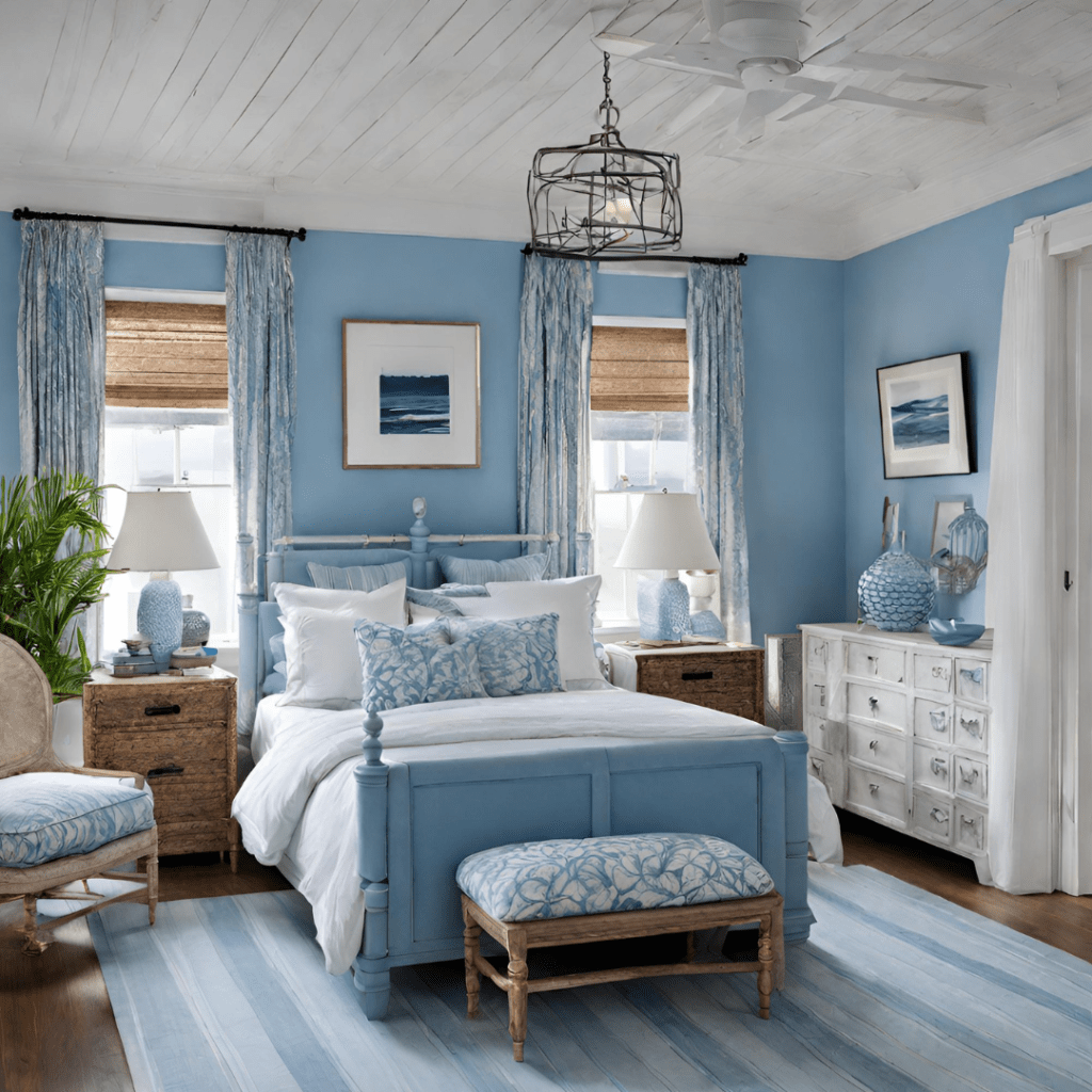
Blue is a highly versatile color that can be easily incorporated into various design styles, from traditional to contemporary. It pairs well with a wide range of other colors, including neutrals like white, gray, and beige, as well as complementary colors like green and yellow. Picture yourself lounging by the tranquil shores of a vast, azure sea. That’s the serene sensation that blue evokes. Often associated with calmness, clarity, and tranquility, blue is the ultimate soother for nerves and restless minds. Whether you opt for a soothing sky blue or a rich navy, infusing your space with shades of blue invites a sense of peace and stability that’s simply unbeatable.
Blue is a common color for bedrooms for this reason – after all, your bedroom is the space you go to at the end of the day to relax and unwind. Blue is also known to promote concentration and productivity, making it a suitable color choice for home offices, study areas, or workspaces. The calming effect of blue can help reduce stress and enhance focus, allowing for better cognitive performance and task completion.
Lighter shades of blue have the visual effect of expanding the perceived size of a room, making it feel more spacious and open. This makes blue an excellent choice for smaller rooms or spaces where you want to create a sense of airiness and light. Deeper shades of blue, such as navy or indigo, can add a sense of depth and sophistication to a room while instilling a feeling of trust and dependability.
Yellow: Sunshine in a Bottle
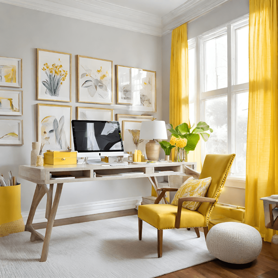
When life gives you lemons, why not paint your walls yellow? Yellow is the epitome of sunshine – warm, cheerful, and bursting with optimism. It’s the color of laughter, joy, and boundless enthusiasm. From soft pastels to vibrant marigolds, yellow injects spaces with a radiant glow that instantly lifts spirits and brightens moods. Embrace the sunny side of life with a pop of yellow in your interiors!
Yellow is often associated with positivity, optimism, and happiness. Its sunny disposition can uplift the mood and create a sense of joy and optimism within a room, making it an ideal choice for areas where people gather and socialize. Yellow is also often linked to creativity and innovation, making it a suitable color choice for areas where brainstorming and creative thinking are encouraged, such as home offices, art studios, or children’s playrooms. Its vibrant energy can inspire and invigorate the mind, fostering a conducive environment for idea generation and exploration. Yellow is inherently associated with sunshine and warmth, making it an excellent choice for bringing brightness and cheerfulness into a room.
Lighter shades of yellow, such as pastel or buttery tones, can create a welcoming and uplifting atmosphere in spaces like kitchens, dining areas, or entryways.
Green: Nature’s Embrace
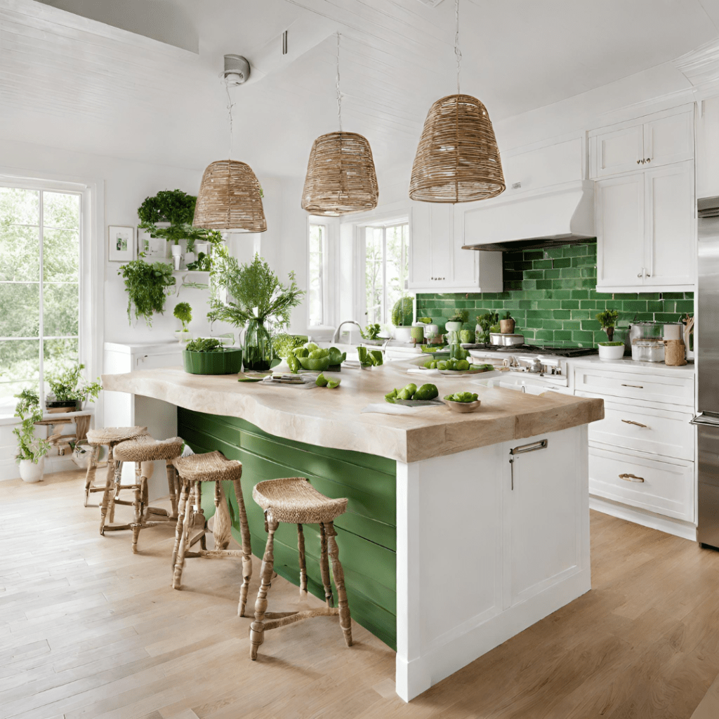
Ah, green – the color of lush meadows, swaying trees, and rejuvenating forests. As the embodiment of nature itself, green whispers tales of growth, harmony, and balance. From earthy olive tones to vibrant emeralds, green infuses spaces with a breath of fresh air and a touch of vitality. Incorporate green into your interiors to create serene sanctuaries that connect you with the beauty of the great outdoors.
Green has a calming effect on the eyes and mind, making it a soothing color choice for spaces where relaxation and unwinding are priorities, such as bedrooms, reading nooks, or yoga studios. Its gentle and tranquil demeanor can help alleviate stress and promote a sense of inner peace. Incorporating plants, botanical prints, or natural materials like wood and stone can further enhance the connection to nature and create a sense of rejuvenation and vitality within a room.
Different shades of green can evoke different moods and emotions. While lighter shades of green tend to be calming and refreshing, deeper shades like emerald or forest green may evoke a sense of richness and sophistication. It’s essential to consider the desired mood and tone of the room when selecting the appropriate shade of green.
Purple: Majestic Magic
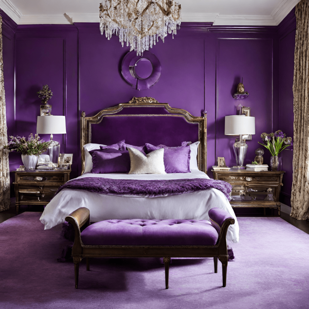
Step into the regal realm of purple, where elegance meets extravagance in a mesmerizing dance of hues. Purple exudes an air of luxury, sophistication, and mystique that’s simply unparalleled. From deep, royal purples to soft, lavender whispers, this majestic hue adds a touch of opulence to any space. Embrace the enchanting allure of purple and transform your interiors into lavish retreats fit for royalty and add a sense of drama and sophistication to any room!
Since purple is often associated with royalty, luxury, and opulence, it’s a popular choice for adding a touch of elegance and sophistication to a room when referring to color psychology in interior design. Deep shades of purple, such as plum or eggplant, can create a sense of richness and grandeur, ideal for formal living rooms, dining areas, or master bedrooms. Purple is also linked to creativity, imagination, and artistic expression. It can inspire a sense of wonder and intrigue, making it a suitable color choice for spaces where creativity and innovation are encouraged, such as home offices, art studios, or reading nooks.
Different shades of purple can evoke different moods and emotions. Lighter shades tend to be more calming and soothing, while darker shades can be more dramatic and intense. It’s important to consider the desired mood and tone of the room when selecting the appropriate shade of purple.
Orange: Zesty Zing
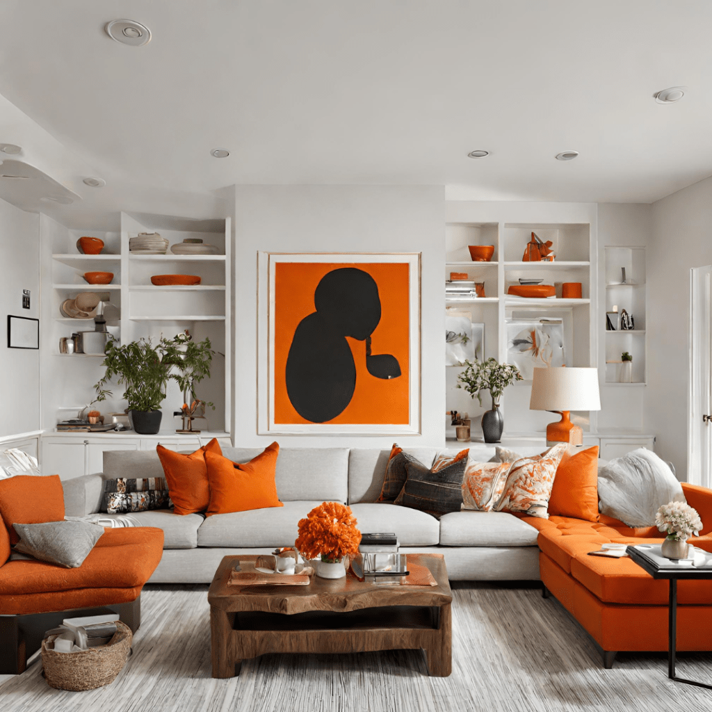
Get ready to spice things up with a splash of orange! Vibrant, energetic, and downright playful, orange is the color of zest and zeal. When referring to color psychology in interior design, orange the hue that ignites creativity, sparks conversations, and injects spaces with a burst of vitality. Whether you opt for a fiery tangerine or a mellow apricot, orange infuses interiors with a sense of warmth and welcome that’s impossible to ignore.
Orange is a warm and energetic color that can inject vitality and excitement into a room. It can be particularly effective in spaces where activity and socialization are encouraged, such as living rooms, dining areas, or playrooms.
If you’re not into painting all of your walls orange, it can serve as a striking accent color when used sparingly in a room. Whether through throw pillows, artwork, or decorative accessories, pops of orange can add visual interest and warmth to a space without overwhelming it. Orange is also found in nature, particularly in fruits like oranges and in autumn foliage, so incorporating natural elements with orange undertones, such as wooden furniture or earthy textiles, can enhance a room’s connection to the outdoors
Pink: Pretty in Pink
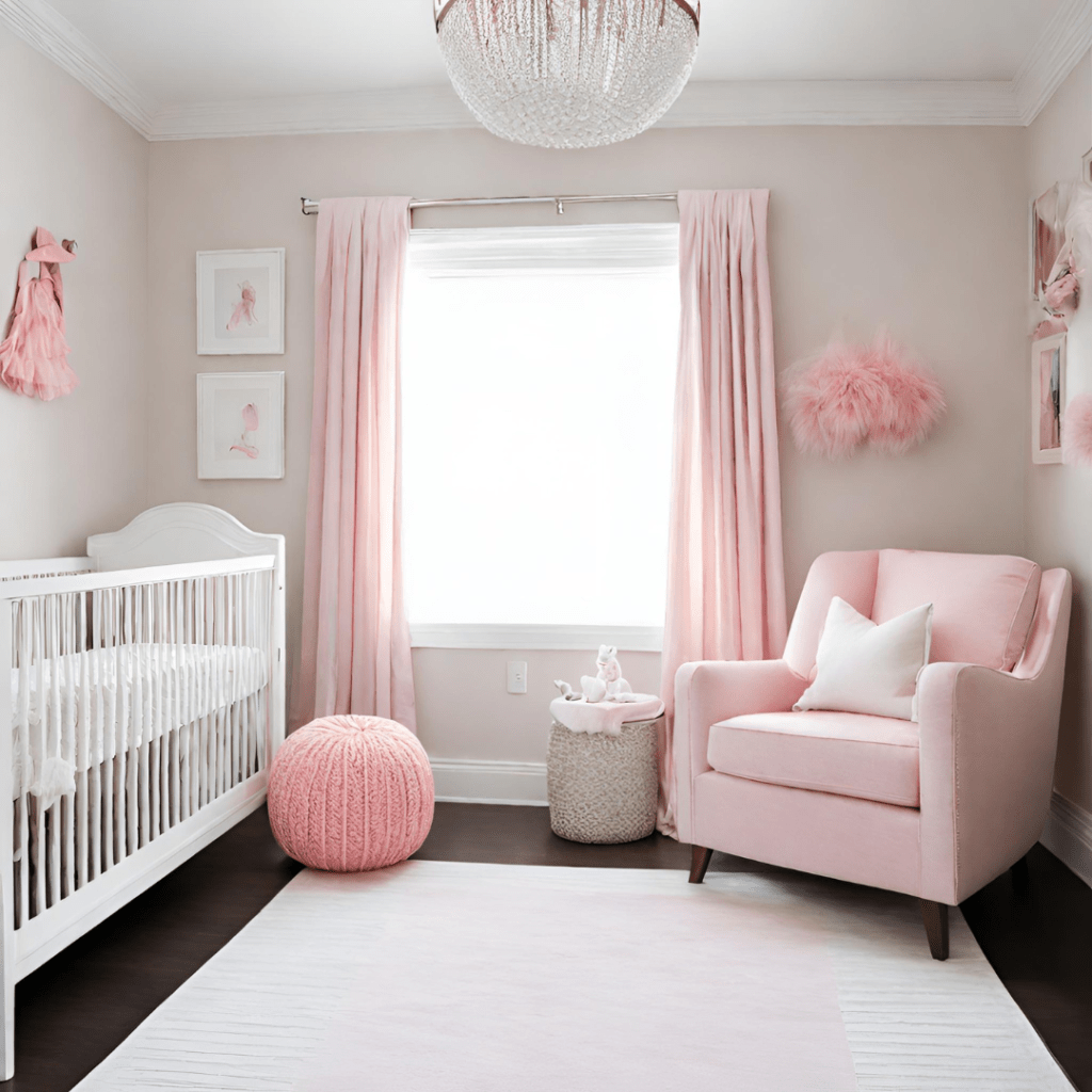
Last but certainly not least, we have the eternally charming hue of pink. Soft, sweet, and undeniably romantic, pink is the color of love, compassion, and all things pretty. From delicate pastels to bold fuchsias, pink adds a touch of whimsy and warmth to any space. Pink has warm undertones that can create a sense of warmth and coziness in a room, particularly when paired with complementary colors like white, beige, or gold. Soft pink accents through throw pillows, curtains, or rugs can add a touch of warmth and sophistication to neutral color schemes, enhancing the overall ambiance of the space.
Pink is often associated with romance, femininity, and sweetness, making it a popular choice for bedrooms, nurseries, and spaces where a soft and romantic ambiance is desired. Pink can also inject a sense of energy and playfulness into a room when used in brighter or bolder shades. Hot pink or fuchsia can add a vibrant pop of color to spaces like children’s rooms, playrooms, or entertainment areas, creating a lively and dynamic environment that stimulates creativity and imagination.
Lighter shades of pink, such as blush or pastel pink, can create a soothing and calming atmosphere, ideal for creating a cozy and intimate retreat. Since pink can range from soft and subtle to bold and vibrant, it’s essential to consider the scale and proportion of its use within a room. Be careful though, while a small pop of pink can add visual interest and charm, too much pink can overwhelm the space and create a sense of visual clutter.
When using pink in interior design, it’s important to consider the overall mood and function of the space, as well as the preferences and personality of the occupants. Whether used sparingly or as a dominant feature, pink has the potential to create a warm, inviting, and stylish environment that reflects the unique personality and style of the homeowner.
The color psychology in interior design offers a fascinating lens through which to understand how our surroundings can influence our emotions, behaviors, and perceptions. From the calming effects of blue to the energizing qualities of yellow, each color carries its own unique associations and impacts. By carefully selecting and incorporating colors into interior spaces, designers can create environments that evoke desired moods, enhance functionality, and reflect the personality and preferences of the occupants. Whether aiming to create a sense of tranquility, stimulate creativity, or foster a warm and inviting atmosphere, the strategic use of color allows us to craft spaces that not only look beautiful but also feel harmonious and enriching to inhabit. Remember, when it comes to color, the possibilities are endless – so don’t be afraid to let your imagination run wild and paint your world with the hues that speak to your soul!
Interested in more? Read more blog posts by Label It Lauren

Stay inspired and up-to-date with our latest blog posts, expert tips, professionally designed rooms, discounts and exclusive content. Join our community of like-minded individuals that are passionate about all things interior design – fuel your creativity and discovery with every click!
Don’t miss out—subscribe now and let the inspiration flow.

Your dream home is just a click away! Label It Lauren Interiors is ready to help make that dream a reality. If you’re looking for a custom professional design to implement into your own home, contact us to get started with any of our virtual interior design services!